LITERAT
Fullstack Developer & Whitewater Kayaker & Scout
Creating a Design System from Scratch: Tips and tricks from a Developer
Building a Design System for one specific product is not that complicated. Building a Design System for 10+ differend products is a challenge worth mention. At LMC, we have been developing such Design System for almost a year on a green field. During that time we have made many mistakes, but we also have learned a lot. Let me give you some tips and tricks from a developer's perspective on how to get started with such a project.

Context
First of all I would like to give you some context about developing a design system from scratch. As you might guess, it's not a matter of one person or one technology.
Something about the Team
A lot of ideas written in this article is not from my head only. There is a team of other developers and designers standing behind ideas and development mentioned in this post.
For the record it is
- Michal Klimt as a product owner and UX/Design Manager
- Tomas Litera, me, as a Design System Lead
- Adam Kudrna as a UI Developer
- Jan Kryšpín as a UI Developer
- Tomáš Sychra as a Software Developer
- Vojta Milerský as a UI Developer
- Kateřina Dlouhá as a Jobs Design System Owner
- Tomáš Janíček as a Software Developer
- Jan Toman as a occasional consultant
Something about the Techstack
Here is a list of technologies and platforms used for developing a desing system that I will be describing in a lines below. I will come back to a couple of technologies later.
- GitHub
- Lerna + Nx => Monorepo
- HTML
- Sass
- Javascript
- Typescript
- React
- PHP
- Symfony
- Twig
- Storybook
- Supernova
- Netlify
- Vite
What it is going to be about
In 2021 Filip Daniško had a talk about scaling Design System in Productboard. Great talk! I took some point from it that I will also mention here in this post.
His main points were about measurement, building community, analyzing the component usage and working with data that are around the design system. But that are points were we currently aren't.
So as you can see on the graph bellow, this article will be much more about tooling, web development, documentation and React and Twig components.
The Beginnings
It has been a more than a year since the designers started to create a system in theirs Figma files and try to maintain and tame the multitude of components between several products.
It was a start of a few product redesigns which should be carried out with better UI and more systematic design.
You maybe do not know but LMC have several products. And in a past few years our portfolio of products outgrow a little bit. Also every product has its own design and needs.
Here is a list of those products:
- Jobs.cz
- Prace.cz
- Seduo.cz
- Teamio.cz
- Atmoskop.cz
- Pracezarohem.cz/Pracazarogiem.pl
- Techloop.cz
- Jobote.cz
- Arnold.cz
- Profesia.sk
- Almamedia.com
Some of those products are better in design and development and has its own UI libraries like Jobs UI, Teamio UI or Seduo UI. Others use at least similar technologies.
And also there are much more Backend and UI engineers than Frontend or UI developers.
So this is the base on we have started our project. Because there was a big demand of sharing components between products on both sides - designers and developers.
Mutibrand Design System
I am not new in design system topics. I know that there are several design system and UI libraries around for a while. Maybe you also know some of them: Apple Human Interface Design, Google Material Design, Microsoft Fluent, Shopify Polaris, Ant Design, IBM Carbon, Adobe Spectrum, Attlasian Design System, Nucleus, Orbit, ... And there are much more. Just check Design System Gallery.
All of them have the same characteristic and that is that are scalling verticaly. Meaning that you can add more and more components and it will still work. But. You can use them on one product on one technology and in a same design.
Well, yes, you can also switch the color using them. Like you are using light or dark mode, switch to high contrast or repaint the component. This we call the Theming or Theme.
So, same library, same technology, multiple themes, one product and one team which maintains it alltogether.
The multibrand was born
Multiple products with different designs require a different approach.
As an excelent example of multibrand, other than LMC, there is the Volkswagen Group.
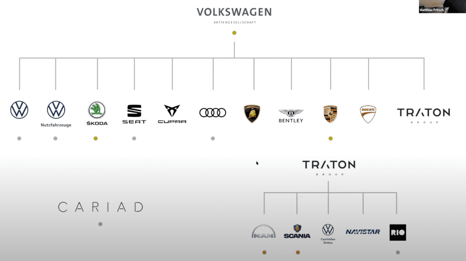
See, multiple products with unique identity and design. That is what I am talking about.
Another great example of the multibrand is maybe the GEL.
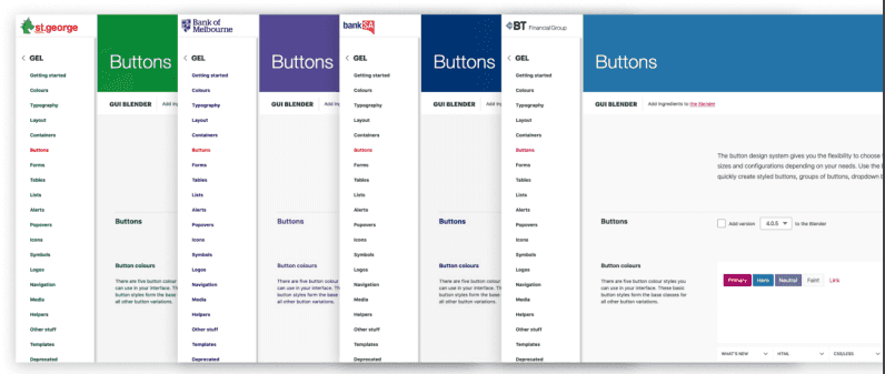
Now you can see the main points between single and multi brand design systems and between theming. So this is a right time to go on and show you some implementation tricks and details.
Tips and Tricks
Product vs Project
Here I will do a first and main mention of Filip's talk. The design system must not be a project. It MUST be a product. It MUST have a product development roadmap. It's backlog. It's development team. And also design system owners on products. On both sides - developer and designer.
The key information is that for design system to work, it has to be product development and it has to be approached that way. It's a long-term journey that doesn't end.
Design vs Development
The development of the design system is not going from bottom up. It sounds simple when you see that somewhere in your product should be a component and sou you just write it down in your favourite IDE with your favourit language. That is the easy way and that doesn't work. Every component must be a part of the system on both sides. In a design, mainly in some Figma file where the UX/designer can easily reuse it in multiple places. And also in the application code which follows the UX prescription.
So developer and designer must work in a close cooperation to deliver new component in both Figma and UI component library.
Also designer does not know full potential of web components nor its edge cases. So there must be a regular revalidation of work on both sides. Developer to designer on the dynamic behavior of the component and its all edge cases. And designer to developer on the right implementation of the design.
For the first time, there was a “holistic view” of the elements, of all their possible combinations, and it was “easy” for me and my colleagues to spot inconsistencies, detect side effects, and find duplications and common patterns.
We were the ones telling designers that sometimes their designs were not consistent, or there were similar UI elements that could be reused instead of creating new ones, or that they were not taking into account some edge cases or problems with different languages.
Everyone was starting to see visible, tangible improvements: modularisation of components, reusability of code & components, increased speed of development, and a better visual consistency & overall quality of the application.
I suggest to read From Zero to Cosmos from Cristiano Rastelli to see the Aha! moments on both sides when building a design system.
Documentation
We are using Supernova - a design-system-as-a-service platform.
Not only for documentation purposes but mainly due to the support of multibrands as I wrote above.
The main features that we use is the integration with Figma and broad support of design tokens. I will look closer to design tokens later in this text but design tokens are the main know-how which allows us to support multiple products with one UI library.
As I wrote the Supernova works not only like a documentation platform, which is great, and you can check our design system Spirit on it right now. It also helps us to track the health status of the components.
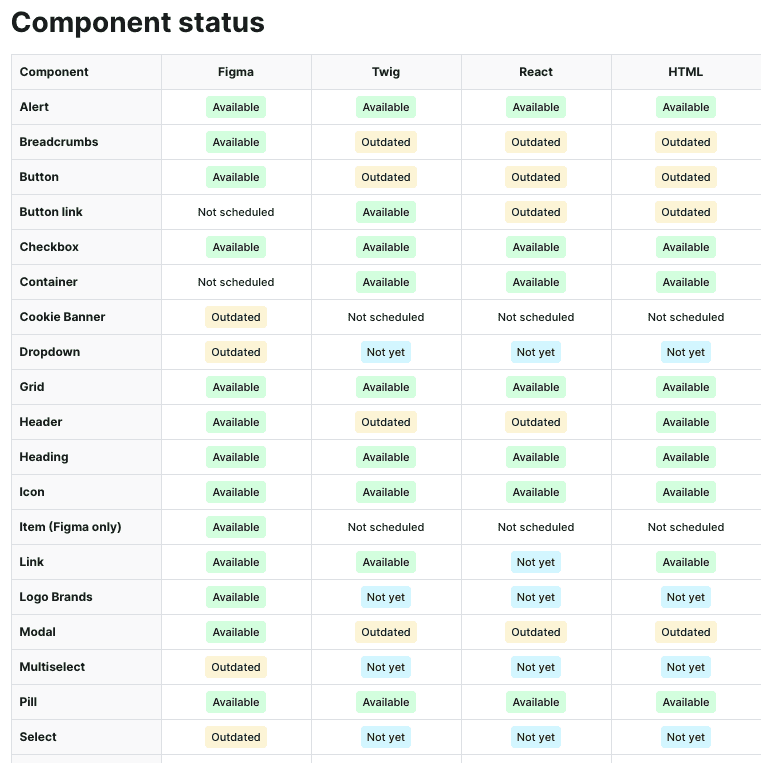
This is great but it not work automatically. The table must be keep up-to-date manually. So we must update it every time something in our components changed. Also there is a lack of some rules which should define components status whether it is healthy or unhealthy (partialy implemented, for example).
Exporters
Magic of the Supernova is in its exporters. We are using them to process changes in Figma, done by designers, to export them into our implementation.
Mainly this is done for our design tokens and assets like icons. These exporters take changes in Figma and create a pull-request into our repositories where we have store our tokens and icons for development. This is done on designer action. So it is kind like a designer is commiting his/her changes and creating a release. Also with proper message describing those changes in Figma.
It is the designer's responsibility to maintain the design system in a right condition and developer's to check and publish those changes into the product.
Architecture
There are two types of the design system - the product one and the common one.
The common one, which we call the Spirit Design System is the main UI library which held common patterns and shared components. These components and tokens are same on every product. For better imagination, the Button component.
Then, there are multiple product design systems which are build on top of the Spirit. They share common components and using tokens they are shaping and color them. For product developer there is only one design system - the product one.
As I mention above, this concept must be maintained on both sides. The product design system must have owner on both sides, the developer, owner of sourcecode, and the designer, owner of the design.
Packages

To support all of our products we had to find a common technological denominator which will allow us to address the most of our products with Spirit Design System.
Because of broad usage of PHP with Symfony framework on backend and Twig template engine and Bootstrap od frontend, the denominator was set to Sass technology.
So we base our architecture on a web package which helds the styles of the components in Sass and uses design-tokens as variables to change on demand of the product. This package also has some utilities and helpers to solve common cases more easily.
Than we have those web-react and web-twig technology packages which are implementing HTML structure of the components in the React and in the Twig. Both are mainly HTML with classes. React adds some dynamic behaviour.
Last but not least design-tokens and icons are changing per product and are exported from Figma via the Supernova.
Typescript
Using Typescript helps us to create another layer of a system in a system :-) In this case mainly in maintaining the props an its values.
We want to prepare for a developers a stable API which will be same across all the components.
Imagine a color prop with values like infomative, success, danger, warning.
And every time some component uses this prop it will also have the same values.
The developer do not need to check the documentation for every component's props.
He/she knows that color prop have these values.
Also it allows us to do prop testing - use one single test for one single prop and run it over all components using that prop. Heaven!
But there is a case with a design which also must generate all those colors for every component that use them. And they know that for some component they will need only 2 colors, for some 3 and that we have inconsistency in our system.
JSX like syntax in Twig
As we are React lovers and JSX syntax are helping us in component approach we saw a problem in using of Twig templates.
To solve this problem we have create what we called TwigX aka Twig eXtended. It is a syntactic sugar for Twig components, the same as is the JSX for React. This allows us to share and write components in JSX style in the Twig templates.
We see this as an opportunity to create component libraries also in Twig. And also a one step close to move from Twig to React and Next.js :-)
Style Props
When creating components we want to be very defensive in order to what allow our developers to do with those components. That leads as to disallow class and style attributes in our components.
A little while later, this decision caught up with us. Developer in some cases need to add custom class or a style to customize the component in a different way.
These were unwanted customization we want to monitor and analyze in the future.
So we copied the approach from Adobe Spectrum which uses UNSAFE_className and UNSAFE_style to allow passing down the custom classes or styles.
Specific prop name can be also track down and also tells the developer that this is not a prefered way.
We also want to add what we called a style props or system props which are props for simple custom styling like adding padding, positioning and so. Those props should be also connected to design tokens.
Zero to Hero configuration
Last but not least the great help comes from the Vite.
With simple and short configuration it allows as to develop and build our packages with ease.
What lays in the future
There are a plenty of things to do ahead of us. Amlost all of the topics Filip talked about in his presentation.
We are missing any kind of measurement. Adoption rate. Usage of components. If the components are deprecated and its health. Missing props and lack of features of the components. Candidates for a shared component and adoption to Spirit.
Also displaying those data in some kind of dashboard and usage of them to future product development. Data, analysis and metrics.
We also need to build our community around design system, support cotribution and spread the know-how across other products. As we started the natural adoption in other teams begun so we are happy that both Atmoskop and Seduo uses what we created.
There are also some technology challenges ahead of us, like support for CSS-in-JS, React Native Apps and design tokens exported in JavaScript.
Wish us a happy coding :-)
References
- Filip Daniško - How we scale design system in Productboard - in czech only
- Design System Gallery
- Between Standard and Flexibility: Volkswagen Group’s Multi-Brand Design System GroupUI
- GEL Design System Example
- From Zero to Cosmos - part #1
- From Zero to Cosmos - part #2
- From Zero to Cosmos - part #3
- Supernova - a design-system-as-a-service platform
- TwigX Bundle - JSX-like syntax for Twig templates
- Adobe Spectrum Styling
- Vite - zero configuration bundler